
http://notinhd.files.wordpress.com/2009/08/baseball-map.jpg
This map, while not representing any established borders within the US is still a fun way to look at the general distribution of MLB fans across the forty eight states. It lists the geographic area of fans of each team within major league baseball, and labels each area with the associated teams colors. The aspects that I find most interesting are the locations in which many teams are only separated by a small distance. In much of the Midwest and South teams are spread out fairly well, which allows for the fan base to cover a broad area. When focusing in on the Northeast or Southern California though, one can see that each team's geographic fan base is much smaller with many teams in much smaller areas. It would be interesting to see how a GIS layer for police arrests during baseball season would look on top of this map. Would areas of high team-overlap contain more arrests than less dense baseball areas?
Map #2 - Solar Radiation

http://morgansolar.files.wordpress.com/2008/08/us_csp_annual_may2004.jpg
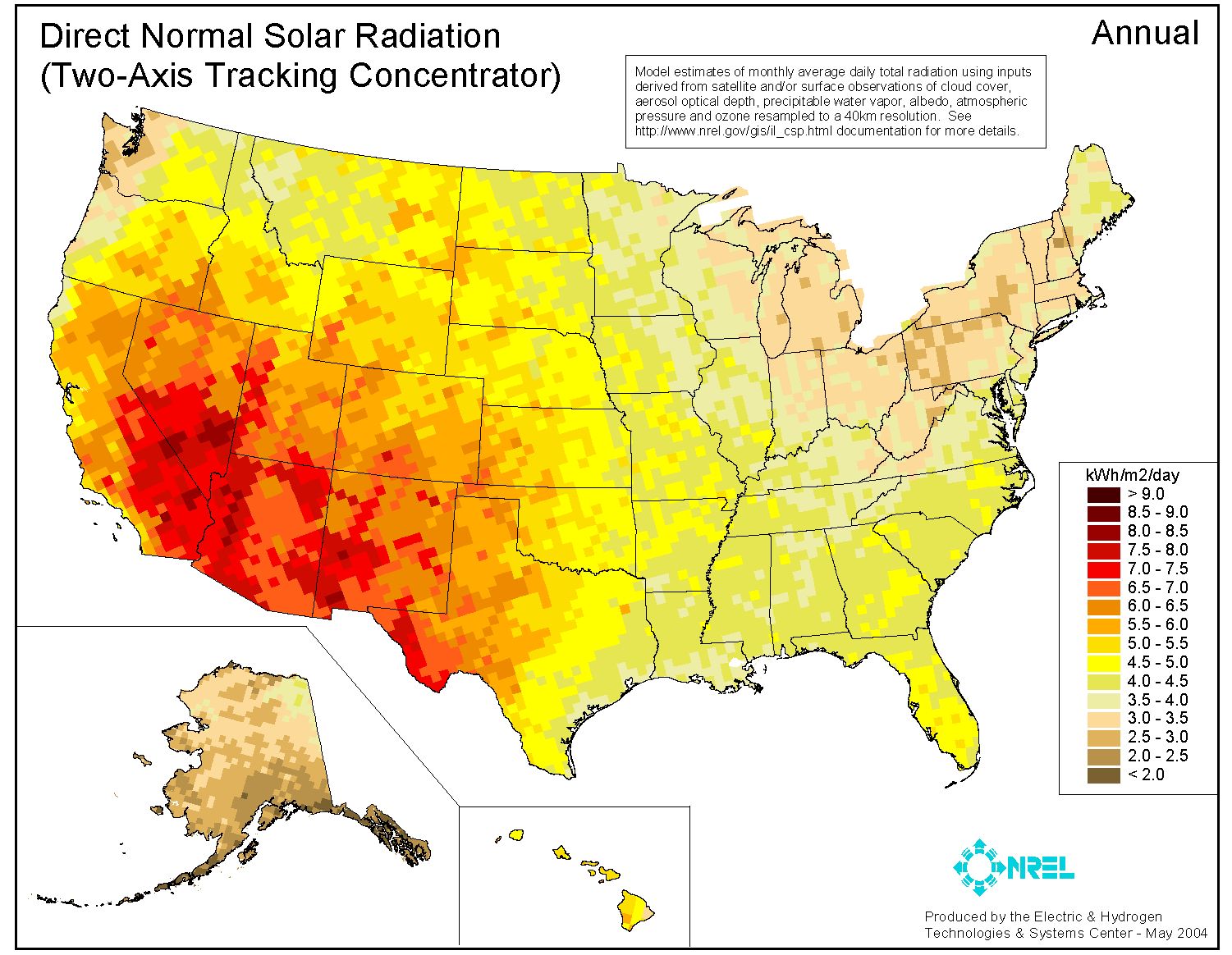
This second map shows the distribution of incoming solar radiation within the fifty states. The solar radiation attribute is measured in kWh/m^2/day, as indicated by the key in the bottom right corner. From the map it is clear to see that the majority of solar radiation in the US is experienced in the Southwest, as shown by the higher concentration of red colored pixels. This type of information is particularly interesting to me as an environmental science major, because it can be used on many levels from urban planning, to wildlife conservation, to renewable energy implementation. This map is the type of map that I am used to working with for other classes, and is the type of representation that I want to be able to create for my future work.
Map #3 - Number of Unhealthy Days

Although this map looks very similar to the solar radiation map above it, the shading throughout the US here illustrates the mean amount of unhealthy days lived by Americans. This is a perfect example of the incredibly diverse uses of GIS and how you can spatially represent data. For example, I probably would have never thought that the most "unhealthy days" in our country occur in Kentucky. Another technical aspect of this map that I really enjoy is the color shading. It's a continuous transition of colors that convey a true distribution and also are easy on the eyes. Maps like this are extremely important for the insurance industry, just another example of the many uses a map can serve.
No comments:
Post a Comment